مصممة جرافيك وهويات بصريــة Visual Identity & Graphic Designer

لكل علامة فكـرة واحدة تستحق أن تُبنى حولها هويــة كاملة. Every brand carries one idea worth building an entire identity around.

أحوّل فكرة العميل إلى نظام بصري متكامل — من الشعار إلى آخر تفصيلة في التطبيق. I turn a single client idea into a complete visual system — from the mark to the last detail of its application.

مقرّيBased in السعوديةSaudi Arabia
أعمل منذFreelancing since 2022
متاحة لـAvailable for مشاريع عن بُعدRemote projects
نبذة About

سلام! أنا سمية الكِندي، أعمل بشكل مستقل منذ 2022 على مشاريع هوية بصرية حقيقية لعملاء من مجالات مختلفة — من علامة تجارية لمنتجات حريرية إلى دار لتحفيظ القرآن الكريم. كل مشروع يبدأ من سؤال واحد: ما الفكرة التي تستحق أن تصبح هوية؟ Hi! I'm Sumaia Ben Ghalib. I've been freelancing since 2022 on real identity projects across different industries — from a Qur'an memorization academy to a silk products brand. Every project starts with one question: what idea is worth becoming an identity?

أومن أن الهوية الجيدة لا تُنسخ من قالب جاهز، بل تُبنى من تفاصيل العميل نفسه — لونه، حرفته، وجمهوره. A strong identity is never copied from a template — it's built from the client's own details: their color, their craft, their audience.

الأدوات Tools
Adobe Illustrator Adobe Photoshop Adobe InDesign Affinity Canva Notion أدوات الذكاء الاصطناعي التوليدي Generative AI Tools

الأعمالSelected work

مجموعة مختارة من أعمالي في الهوية البصرية والتصميم الجرافيكي. A curated selection of my work in visual identity and graphic design.

استكشف المشاريع والتفاصيلExplore the projects and details →

نبني للفكرة هوية تحيا بها. We give the idea an identity to live by.

لنعمل معًاLet's work together

أعمل حاليًا بشكل مستقل، ومتاحة لمشاريع هوية بصرية عن بُعد.
اكتب لي وخلينا نبدأ!
Currently freelancing and open to remote brand identity projects.
Send a message and let's get started!

دار رواحةRawaha Academy
هوية بصريةBrand identity

رواحة Rawaha

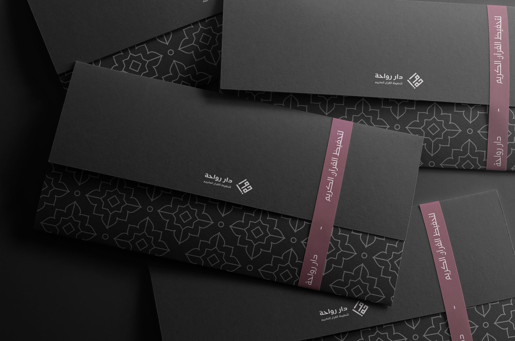
مشروع إعادة تصميم شعار وهوية بصرية لدار حقيقية لتحفيظ القرآن الكريم، يوازن بين الأصالة الدينية والوضوح البصري المعاصر، ضمن نظام بصري مرن وقابل للتوسّع. A redesign of the logo and identity for a real Qur'an memorization academy, balancing religious authenticity with contemporary visual clarity, inside a flexible system built to grow.

الدورRoleتصميم هوية بصريةVisual Identity Design
السنةYear2026
النطاقScopeشعار · نظام بصري · تطبيقاتLogo · Visual System · Applications
الفكرةIdea

استُلهم الشعار من الخط الكوفي المربّع، وعولج بأسلوب هندسي يعتمد على وحدة "المعيّن" ليعكس الوضوح والبساطة دون قسوة بصرية. The mark draws on Square Kufic calligraphy, rebuilt around a diamond (rhombus) module for a clean, uncluttered presence.

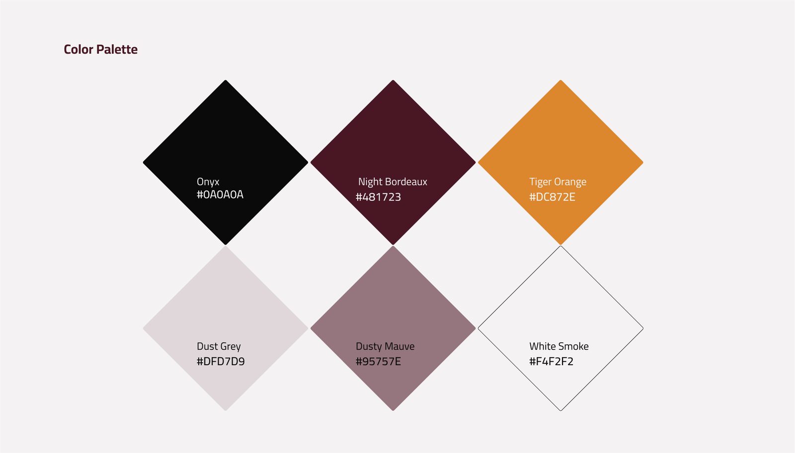
اختيرت لوحة الألوان لتكون عملية وشاملة: العنابي والأسود والأبيض للاستخدامات الرسمية وبناء الحضور المؤسسي، والوردي والرمادي المغبرّان كدرجات محايدة للمواد العامة، مع الأصفر كلون جذب للـCTA. The palette was chosen to be practical and versatile: maroon, black and white carry the formal, institutional presence, muted rose and grey serve everyday materials, and yellow is reserved for calls to action.
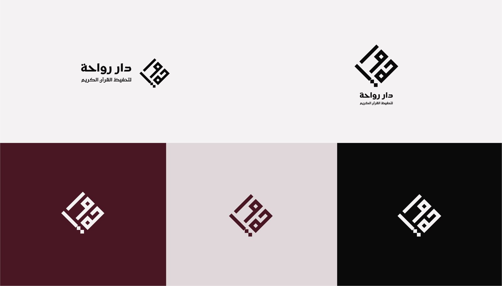
Rawaha logo variations
Rawaha color palette
المنهجيةProcess

بعد تحليل نقاط ضعف الشعار السابق، أُعيد بناؤه على شبكة هندسية تضمن وضوح البناء الشكلي وسهولة إعادة الاستخدام بالنسخ الأفقية والعمودية. After diagnosing the weaknesses of the previous logo, it was rebuilt on a geometric grid that keeps its construction clear and easy to reuse across horizontal and vertical formats.

وُسّعت الفكرة إلى نظام بصري متكامل: أشكال وأنماط مشتقة من وحدة المعيّن، بمسارين للاستخدام — نمط زخرفي رسمي للاستخدامات المؤسسية، ونمط هندسي مبسّط للاستخدامات اليومية. The idea expanded into a full visual system: shapes and patterns derived from the diamond module, split into two tracks — a formal decorative pattern for institutional use, and a simplified geometric one for everyday materials.

للنظام الطباعي، اعتُمد خط Kufam للعناوين لثباته الهندسي، وخط Cairo للنصوص لوضوحه في القراءة. For type, Kufam carries the headlines for its steady geometric presence, while Cairo handles body text for easy reading.
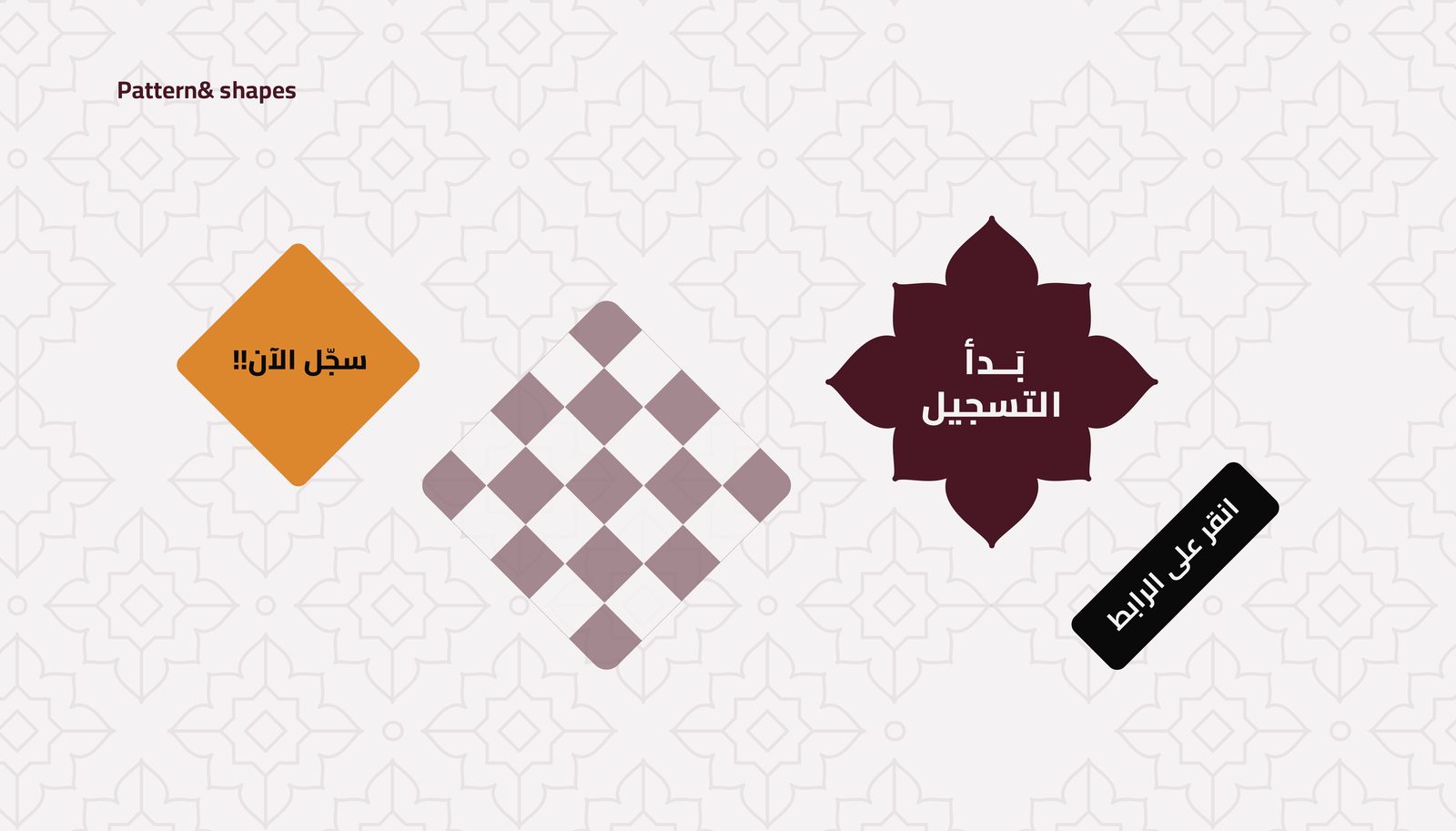
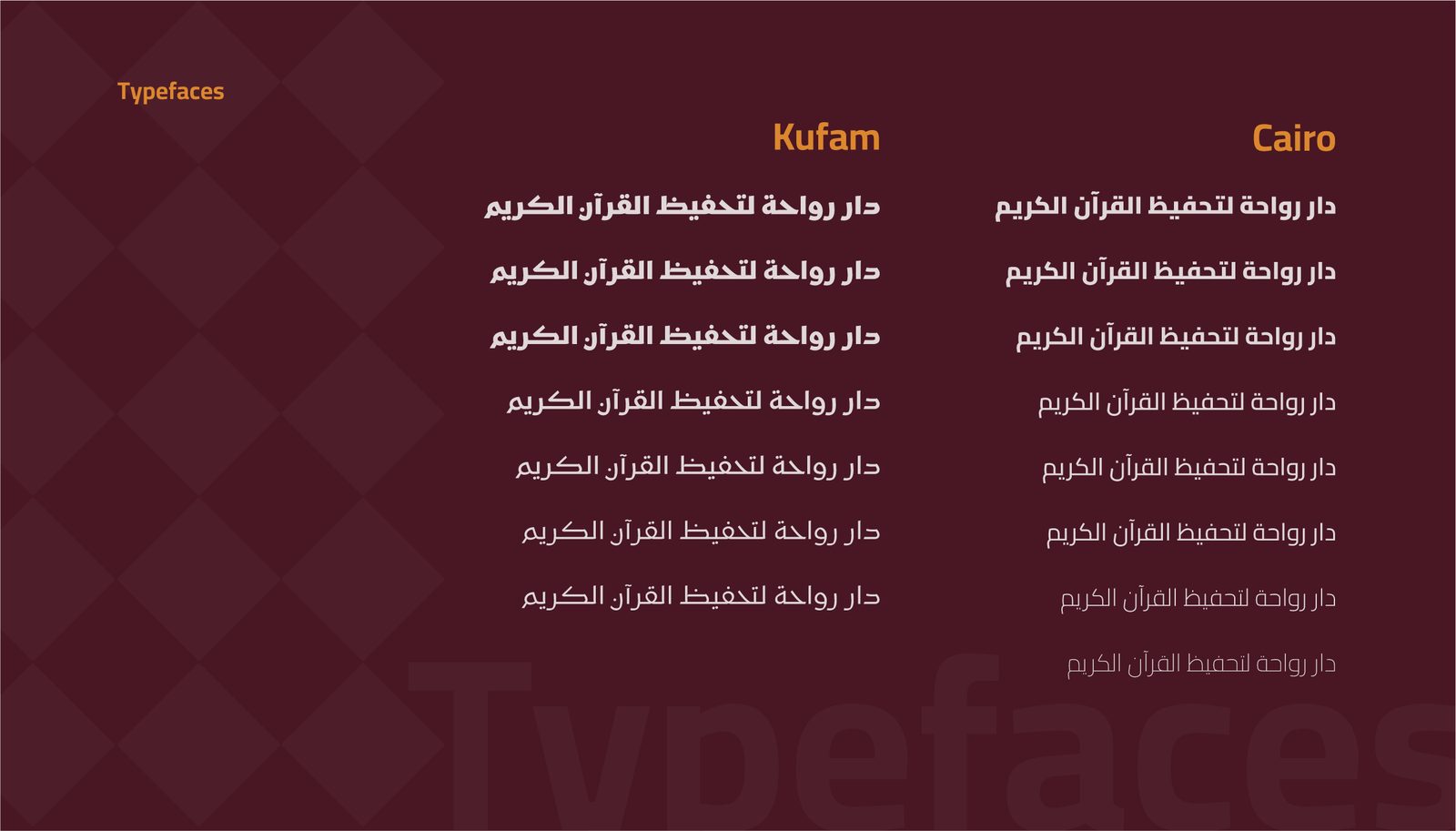
Rawaha shapes and patterns Rawaha typography system
التصميمDesign

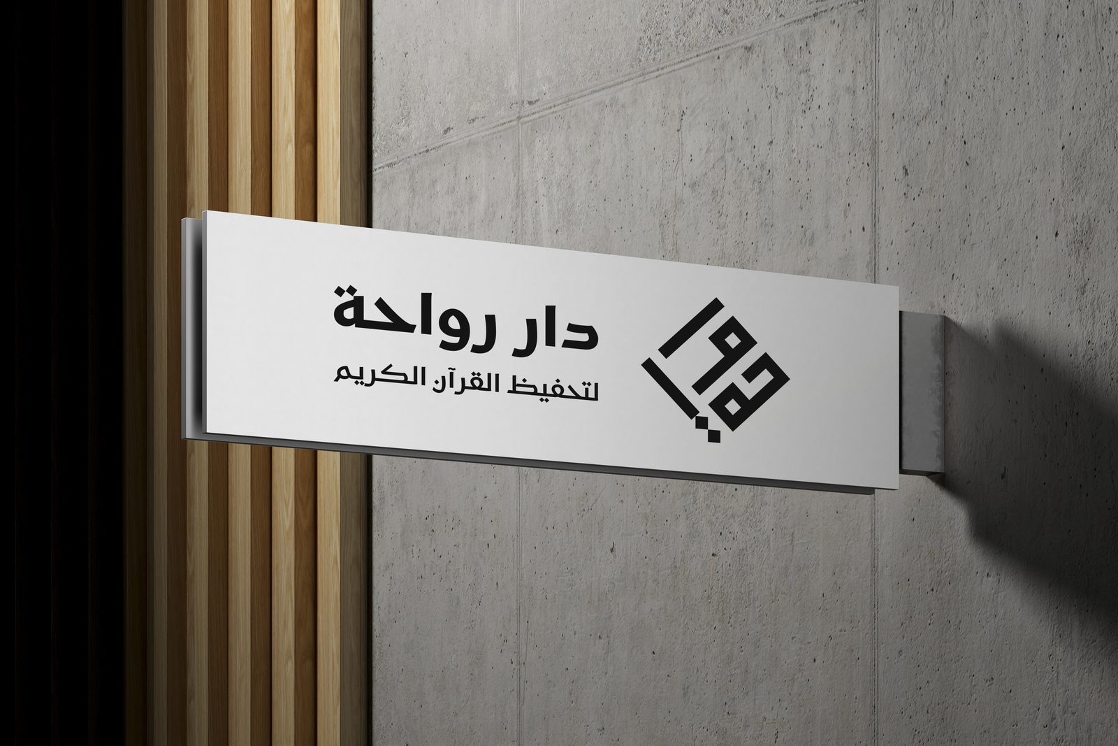
من اللافتة الخارجية إلى الأكياس والمغلّفات، يتنقّل النظام البصري بين مستويات مختلفة: حضور واضح للفت الانتباه، هدوء مؤسسي للتواصل الرسمي، ووجه يومي أبسط للاستخدامات القريبة من الجمهور. From outdoor signage to tote bags and envelopes, the system moves across registers: bold for visibility, calm and formal for institutional communication, and simpler for everyday, audience-facing pieces.
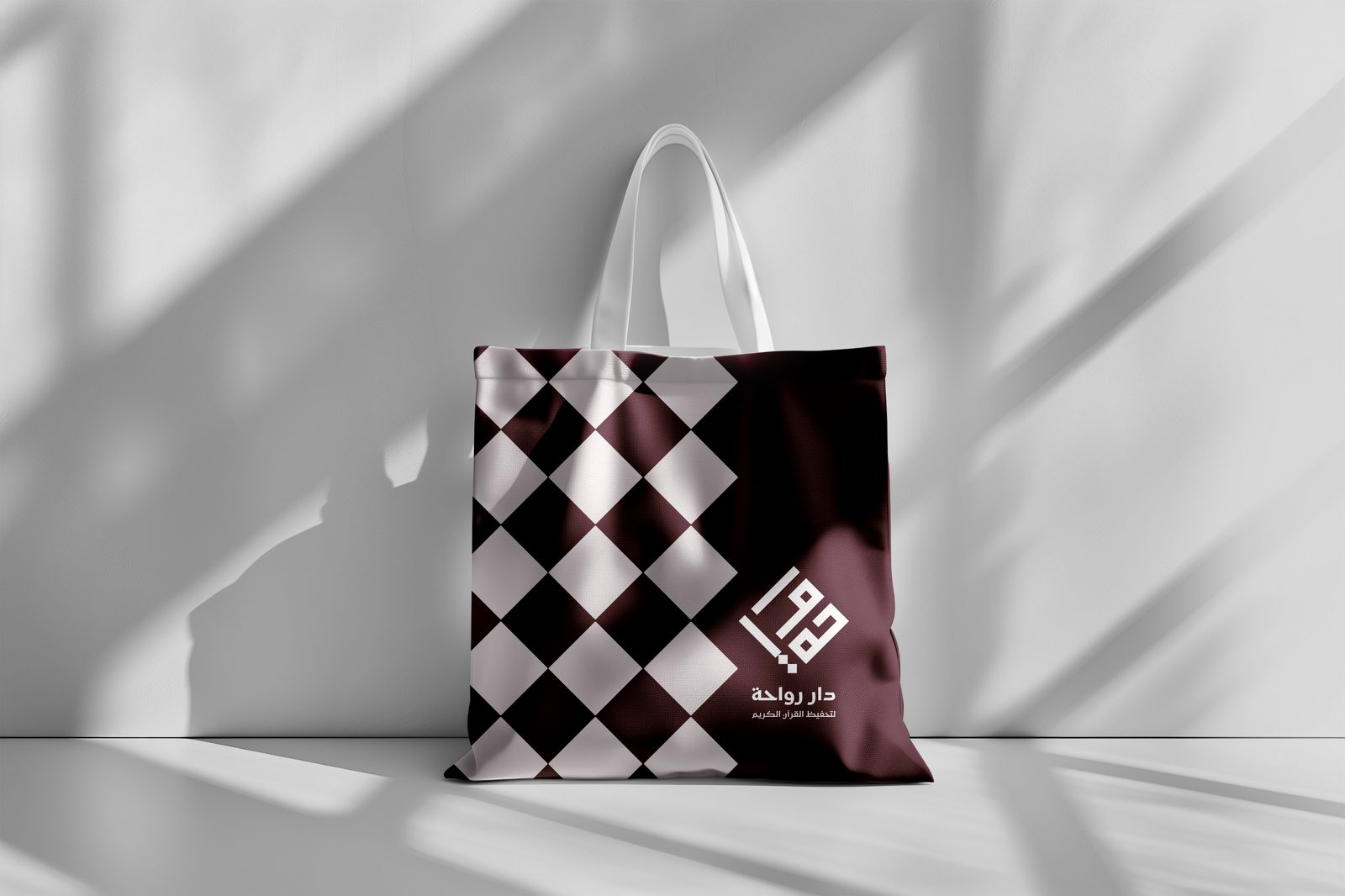
Rawaha tote bag application
Rawaha outdoor signage

النتيجة: هوية تحوّلت من مجرد شعار إلى نظام بصري قابل للنمو مع الدار. The result: an identity that grew from a single logo into a visual system built to scale with the academy.
ملاذ الحريرMalath Al-Hareer
هوية بصرية · متجر إلكترونيBrand identity · e-commerce

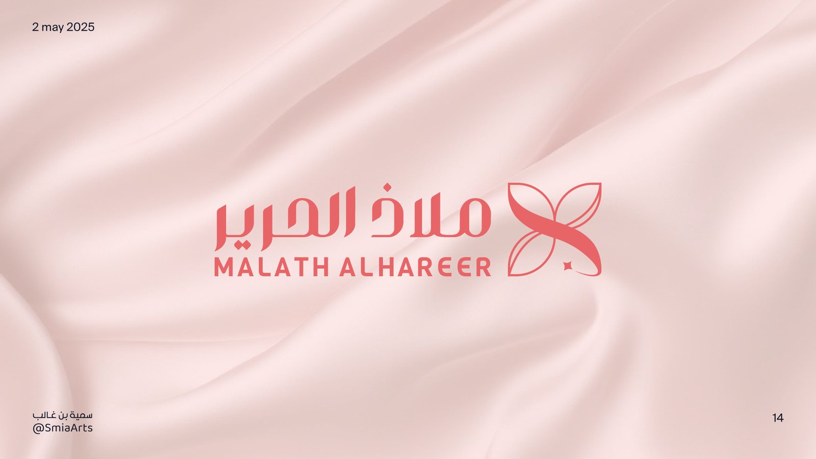
ملاذ الحرير Malath Al-Hareer

مشروع تصميم شعار بنظام تطبيقي موسّع لمتجر إلكتروني متخصص في المنتجات الحريرية الطبيعية، يحافظ على طابع العلامة الراقي والأنثوي عبر مختلف الوسائط. A logo and extended application system for an online shop specializing in natural silk products, keeping the brand's refined, feminine character consistent across every medium.

الدورRoleتصميم هوية بصريةVisual Identity Design
السنةYear2025
النطاقScopeشعار · نظام بصري · تطبيقاتLogo · Visual System · Applications
الفكرةIdea

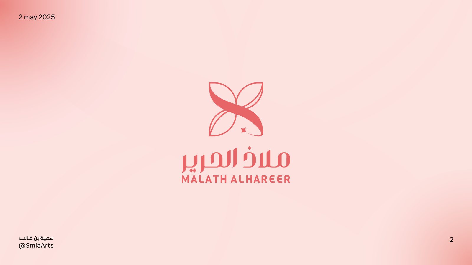
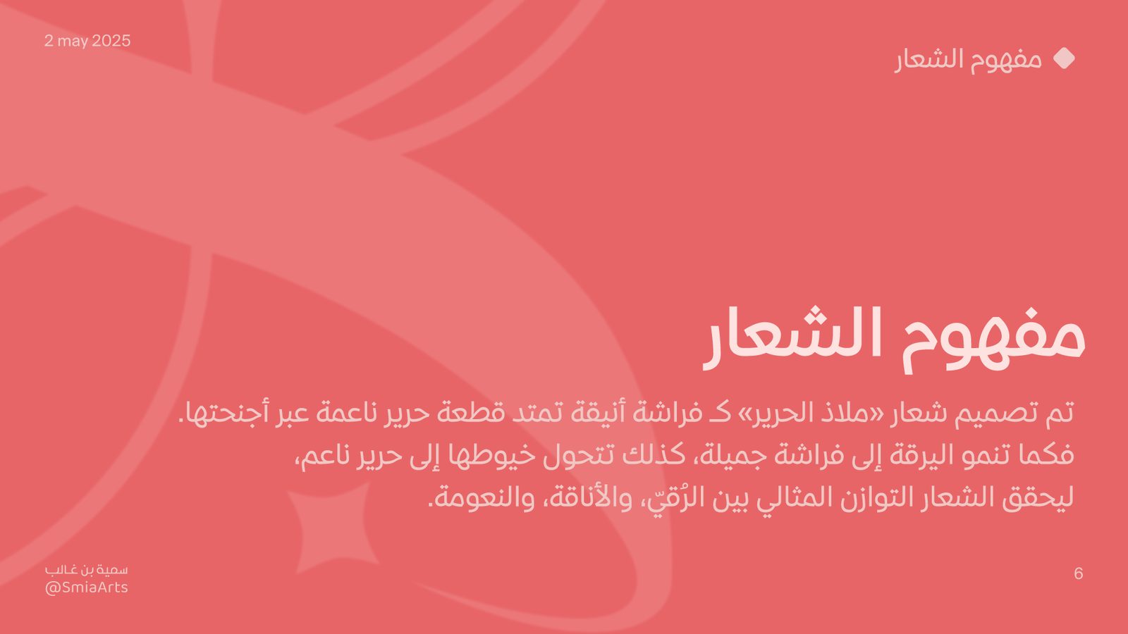
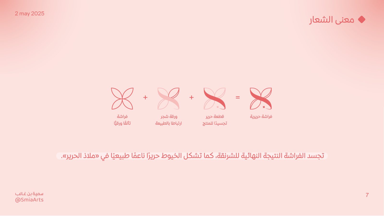
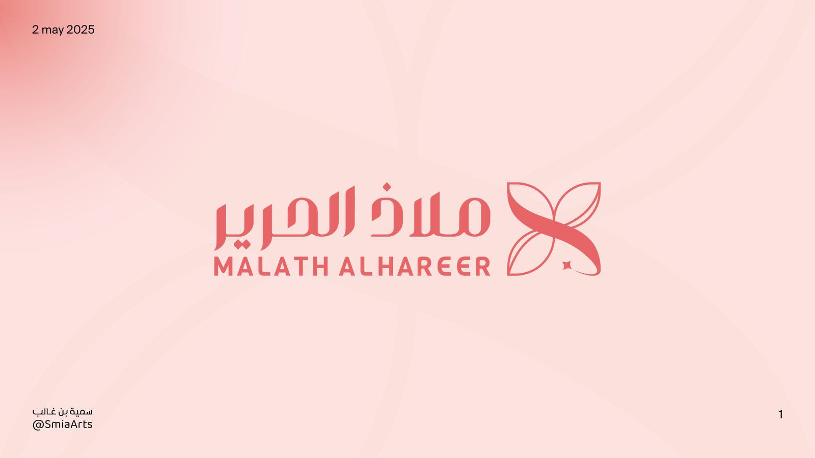
انطلق تصميم الشعار من مفهوم الملاذ — كحالة هدوء شخصية وسط إيقاع الحياة اليومية. جُسّد المفهوم عبر فراشة مستوحاة من طبيعة الحرير وانسيابيته، لتكوّن ارتباطًا بصريًا مباشرًا مع جوهر العلامة. The mark grew from the idea of a refuge — a moment of personal calm inside the pace of daily life. That concept took shape as a butterfly inspired by silk's fluid, natural movement, creating a direct visual link to the brand's core.

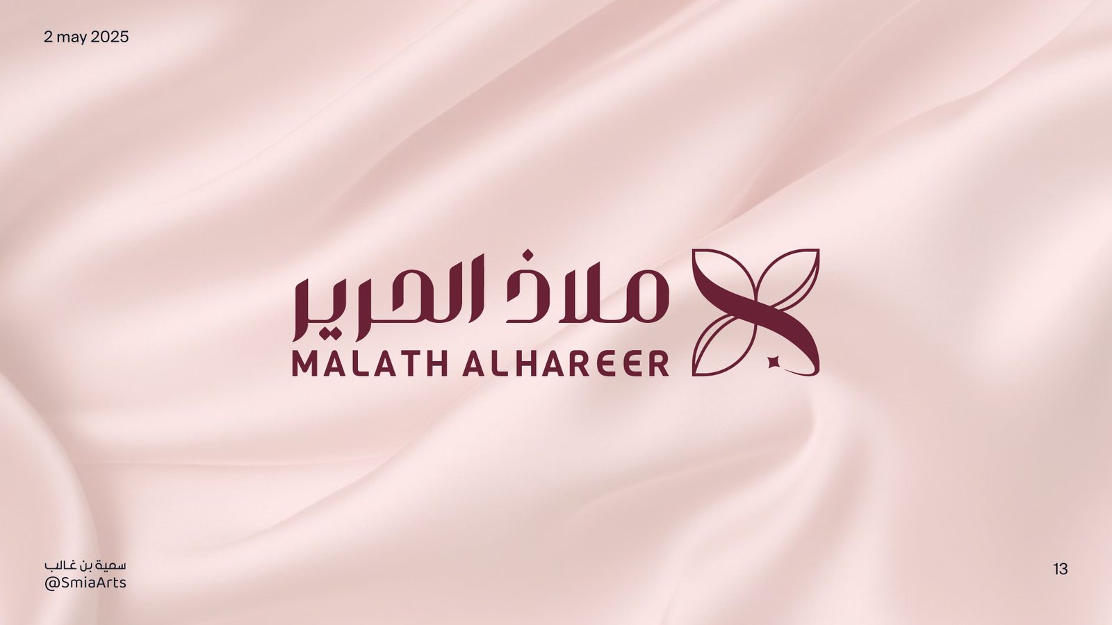
صُمم الشعار النصي العربي خصيصًا ليتناسق مع الرمز، محافظًا على وضوح القراءة وسهولة التطبيق. The Arabic wordmark was custom-built to match the symbol, keeping legibility and ease of application front and center.

Malath slide 1 Malath slide 2
Malath slide 3 Malath slide 4
Malath slide 5
Malath logo concept and philosophy
Malath slide 7
Malath slide 8
المنهجيةProcess

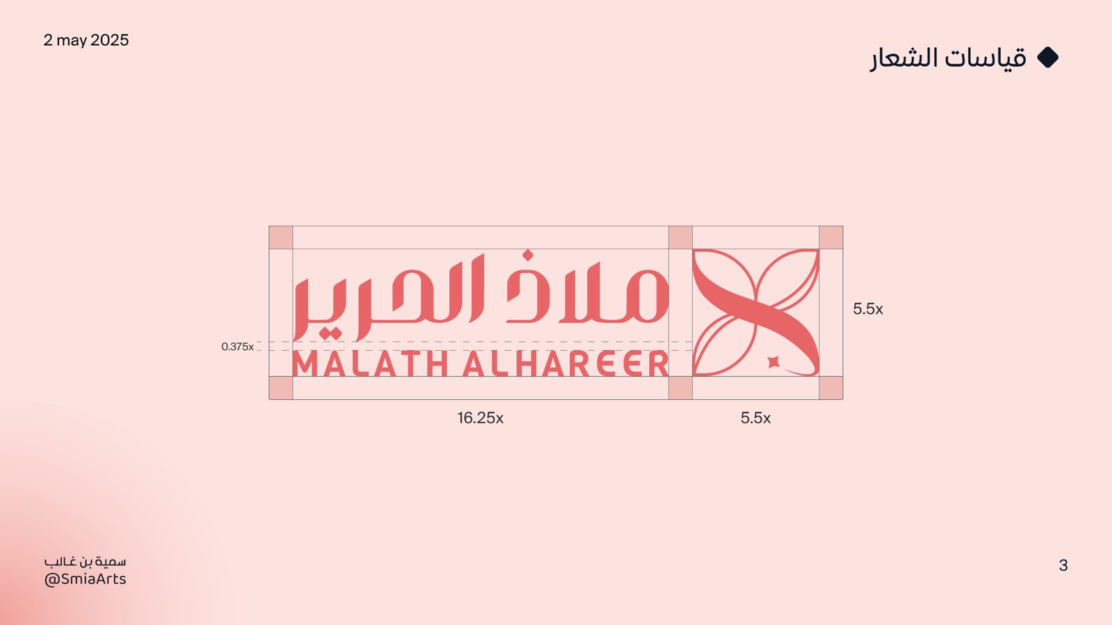
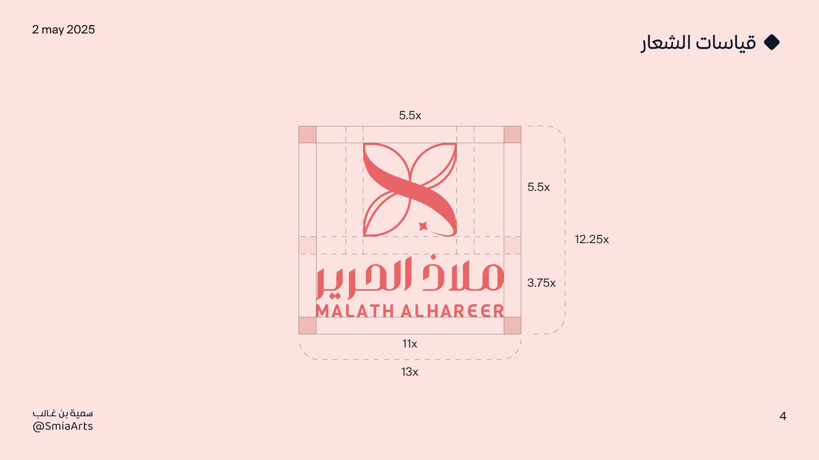
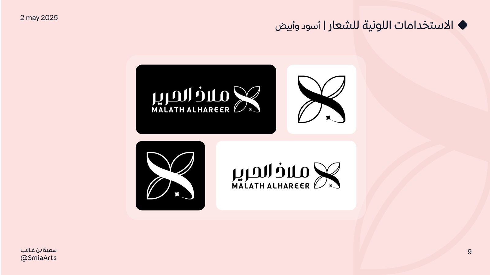
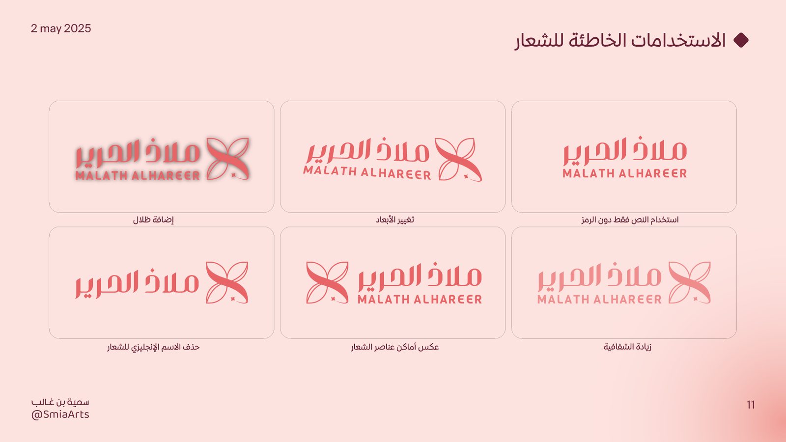
طُوّر الشعار كنظام بصري موسّع يشمل النسخ الأفقية والعمودية، وضبط العلاقات الهندسية والقياسات لضمان توازن بصري بين الرمز والنص، إلى جانب قواعد استخدام واضحة للمسافات الآمنة وحدود التعديل. The logo grew into an extended system covering horizontal and vertical lockups, with precise geometric relationships balancing mark and wordmark, plus clear usage rules for safe spacing and what can and can't be altered.

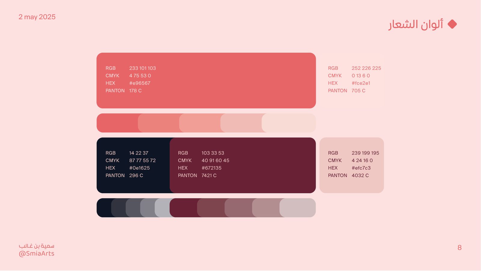
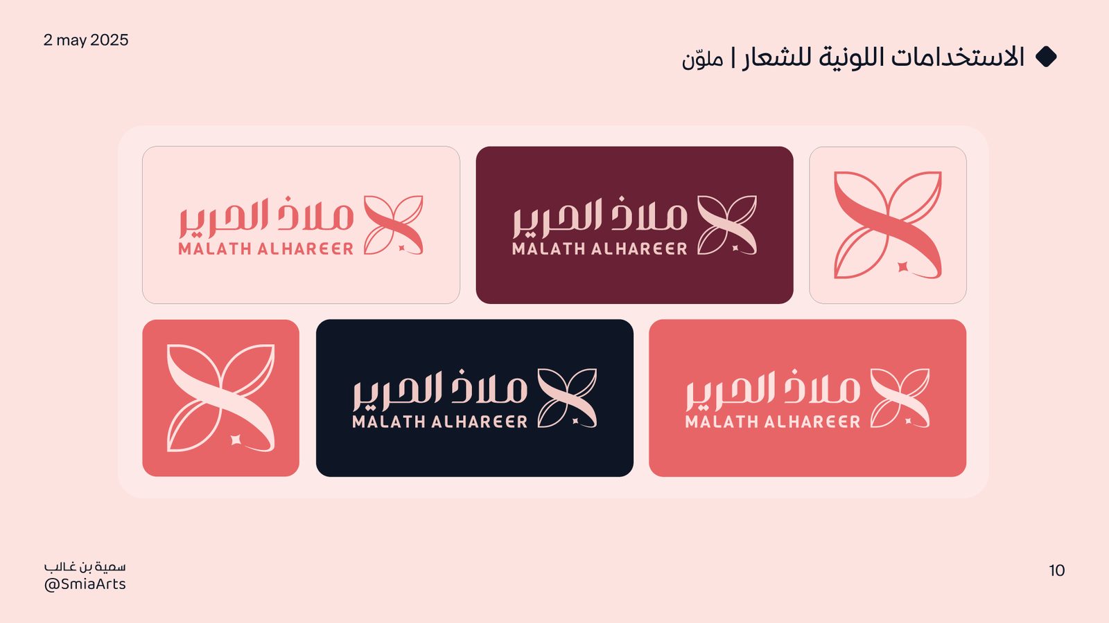
اختيرت لوحة ألوان متوازنة تعكس الطابع الأنثوي الراقي، بعيدًا عن الوردي التجاري المعتاد: تدرّج بين الوردي الناعم للكمال والنعومة، والكحلي والعنابي للفخامة والرقي. The palette was chosen to feel refined and feminine without falling into commercial pink: a range between soft blush for gentleness, and navy and burgundy for a more luxurious tone.

Malath slide 9 Malath slide 10
التصميمDesign

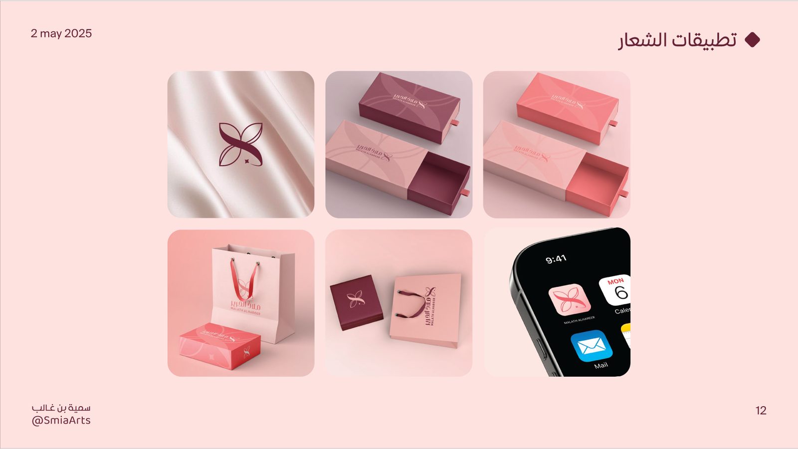
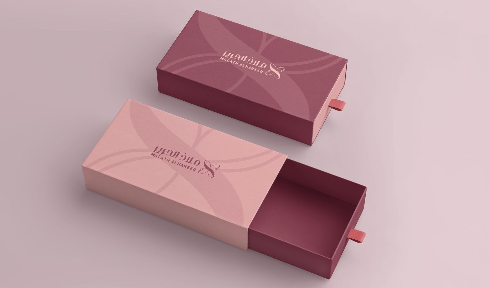
اختُبر الرمز والنص على خلفيات وتطبيقات مختلفة — من التغليف إلى منتجات العناية — للحفاظ على حضور هادئ ومتوازن أينما ظهرت العلامة. The mark and wordmark were tested across different backgrounds and applications — from packaging to care products — to keep a calm, balanced presence wherever the brand shows up.

Malath incorrect logo usage examples
Malath product mockups and applications
Malath slide 13
Malath slide 14
Malath slide 15

النتيجة: هوية تعكس رقة المنتج دون أن تفقد حضورها التجاري. The result: an identity as refined as the product itself, without losing its commercial presence.

مجموعة بوستراتPoster collection
جرافيك · بوستراتGraphic design · posters

بوسترات مختارة Selected posters

أربعة بوسترات مستقلة، كل واحد بفكرة وتحدٍّ تصميمي مختلف. انقر على أي بوستر لاستكشاف تفاصيله! Four standalone posters, each with its own idea and design challenge. Click any poster below for details.

الدورRoleتصميم جرافيكGraphic Design
السنةYear2025
النطاقScopeتصميم بوستراتPoster Design
Space poster mockup Space poster design close-up

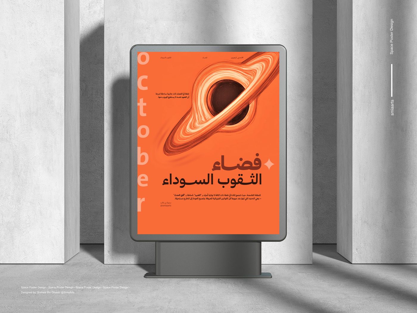
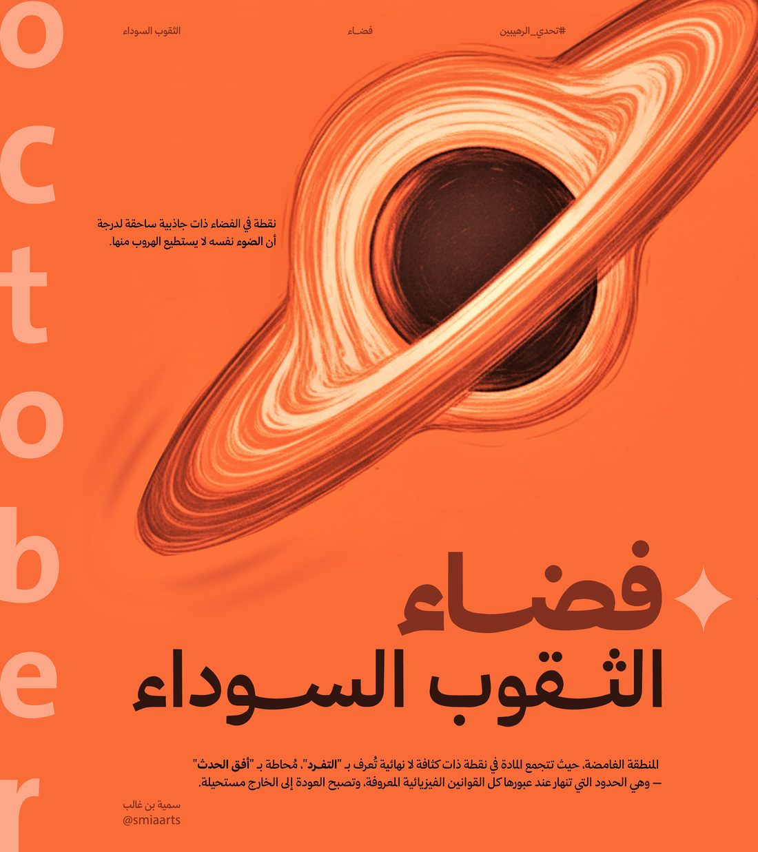
تجربة أحادية اللون مستوحاة من الفضاء، تتمحور حول اللون البرتقالي لتمثيل الثقوب السوداء ومنح عمق بصري. نُظّم المحتوى بشبكة صارمة، وطُبّقت مبادئ تيبوغرافية مكتسبة من ورشة عمل — والتحدي الأساسي كان الموازنة بين البساطة والوضوح ضمن لون واحد. A monochrome, space-inspired piece built around a single orange, standing in for a black hole's pull and depth. Content sits on a strict grid, applying typography principles learned in a workshop — the real challenge was staying simple and legible using only one color.

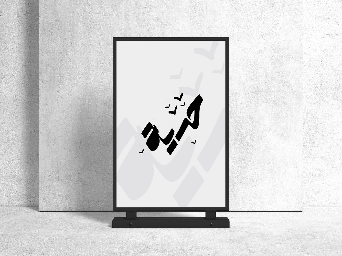
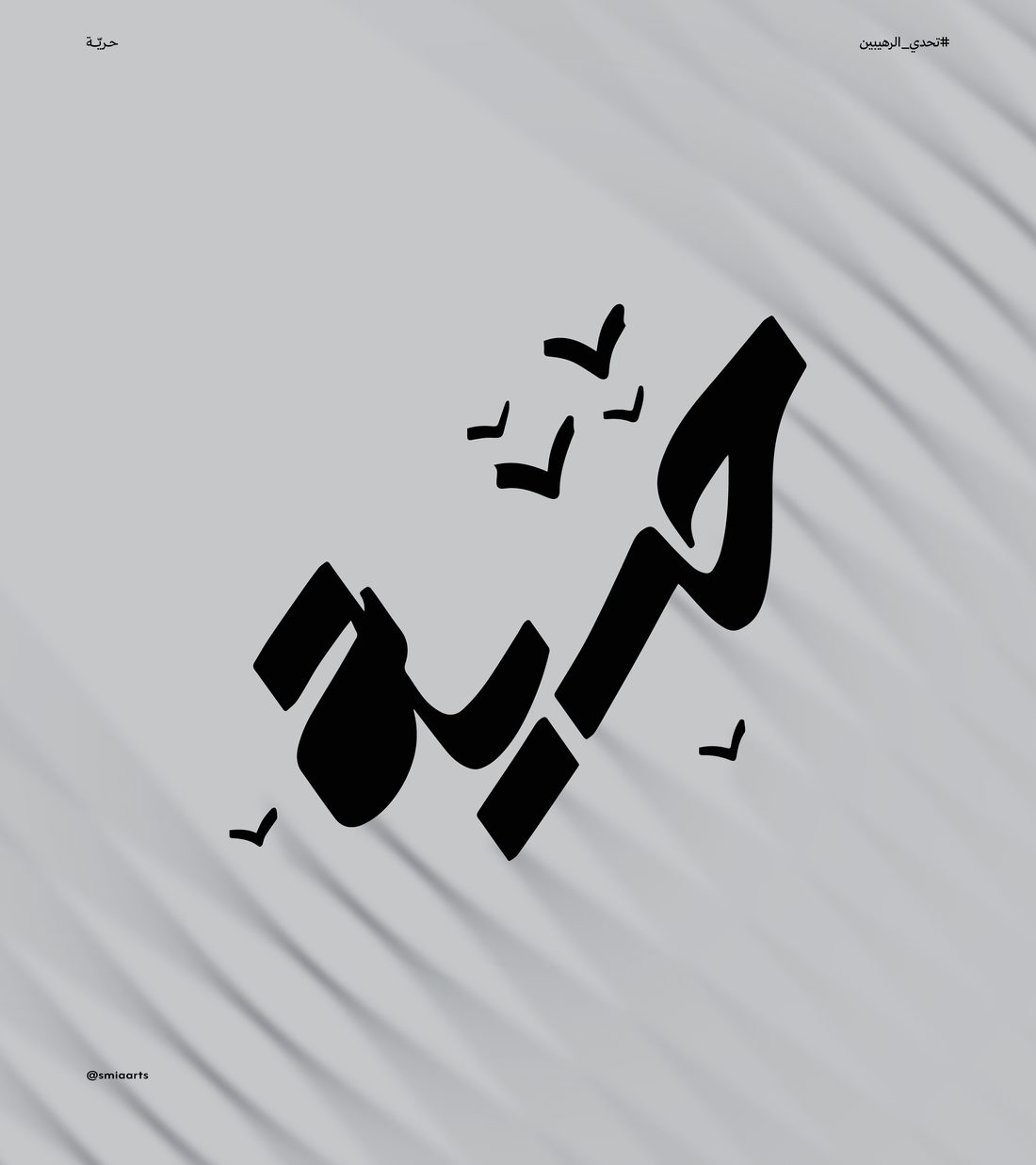
Freedom poster mockup Freedom poster design close-up

شعار خطي مكتوب باليد يجسّد مفهوم "الحرية" بخط انسيابي، مع أشكال طيور محلّقة وخلفية متموّجة تكسر الجمود، وتباين عالٍ بالأسود والرمادي بدل الأبيض. A hand-lettered wordmark for the idea of "freedom," written in a free, flowing script, with flying birds and a rippling background that break the stillness — set in high-contrast black and grey instead of white.

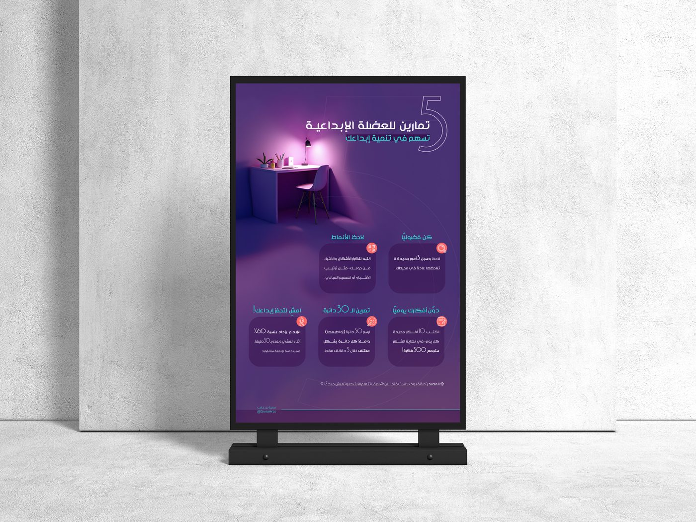
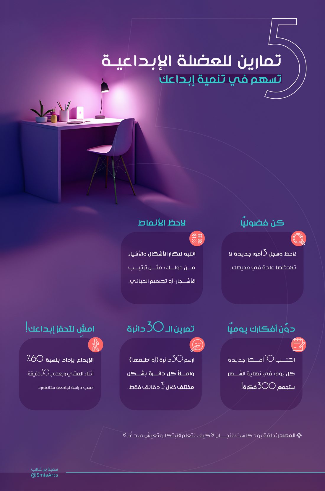
Creative infographic mockup Infographic design close-up

إنفوجرافيك مصمم ليُحفظ بسهولة، بلون بنفسجي وإضاءة مركزة تُبرز مساحة العمل، وتقسيم منظم للبطاقات يخدم انسيابية القراءة. اعتمدت المنهجية على تقسيم المحتوى أولًا إلى بطاقات مستقلة حسب الفكرة، ثم توحيدها بلوحة لونية وإضاءة واحدة لضمان الانسجام البصري. An infographic designed to be memorable — purple, with focused lighting that highlights the working area, and cards organized for an easy reading flow. The process started by breaking the content into separate idea-based cards, then unifying them under one color palette and lighting for visual cohesion.

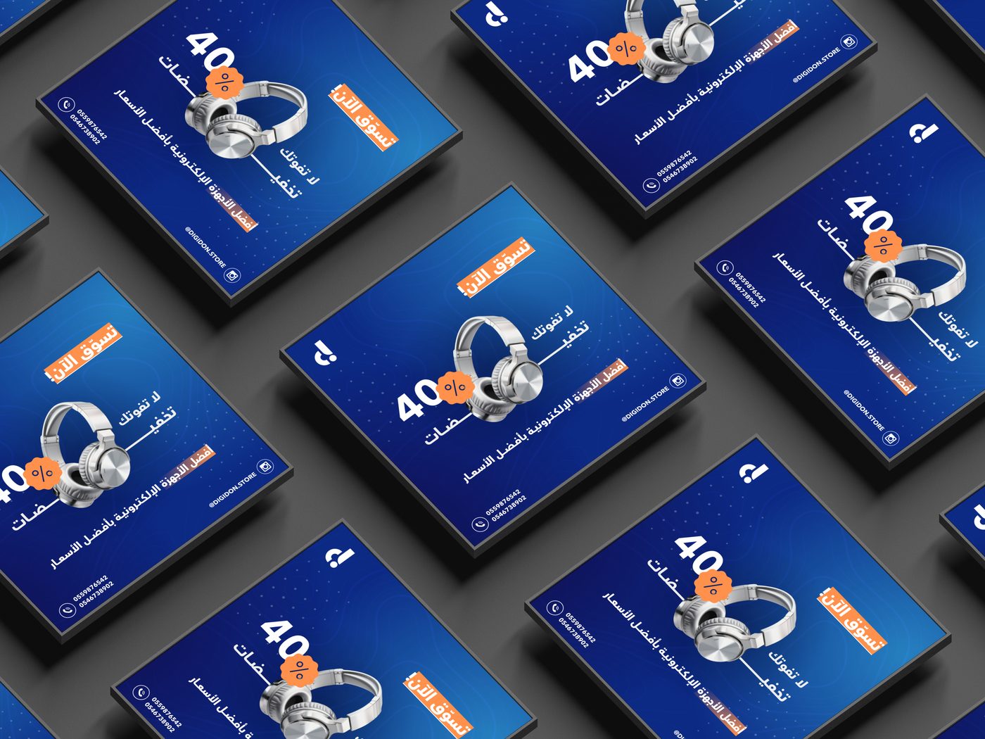
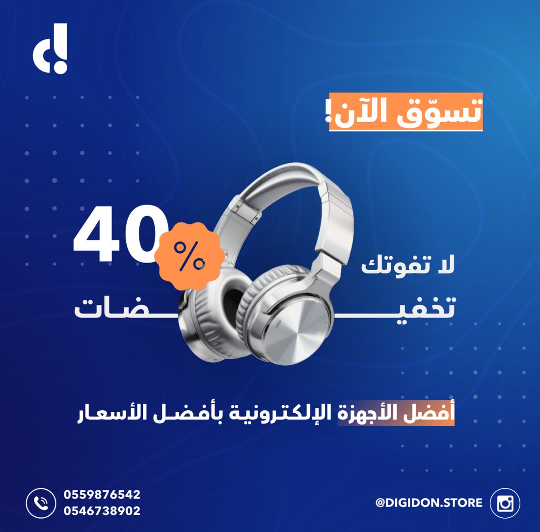
Product ad poster mockup Product ad design close-up

منشور ترويجي لمنتج إلكتروني (سماعة رأس) يعتمد تسلسلًا هرميًا بصريًا واضحًا، بخلفية زرقاء تقنية ولمسات برتقالية تقود العين نحو العرض والدعوة لاتخاذ إجراء. A promotional post for an electronics product (headphones), built on a clear visual hierarchy — a technical blue backdrop with orange accents guiding the eye toward the offer and its call to action.